

TL;DR:
- Choosing art for home decor involves assessing space, selecting appropriately sized pieces, and matching styles and colors thoughtfully. Protect delicate artworks from light damage and use renter-friendly hanging methods to avoid wall damage. Personalize your collection by choosing pieces that evoke genuine interest and can be easily rearranged over time.
Choosing art for home is the process of selecting pieces that enhance your living space, reflect your personal style, and interact with your room’s dimensions, lighting, and existing décor. The right artwork does more than fill a blank wall. It sets the mood of a room, anchors furniture arrangements, and tells visitors something true about who you are. This guide covers every step, from reading your room’s proportions to hanging art without damaging your walls, using expert rules from designers like Kit Kemp and Martha Stewart to make each decision easier.
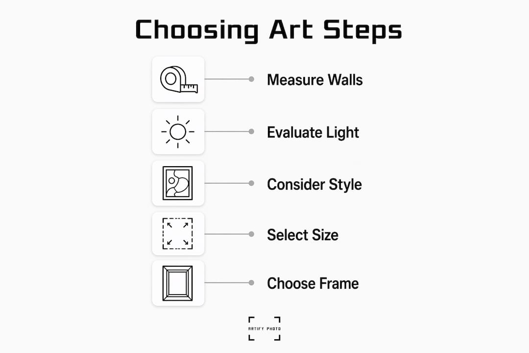
How to assess your room before choosing art for home
The first step in selecting art is understanding the space it will live in. Wall size, ceiling height, natural light, and room function all shape which pieces will work and which will fall flat.
Start by measuring your walls. A large, open wall in a living room calls for a statement piece or a gallery arrangement. A narrow hallway needs something vertical and contained. Kit Kemp Design Studio advises that art must relate to furniture size, ceiling height, and available wall space to avoid looking lost or disjointed. That relationship between art and architecture is what separates a thoughtful room from a random one.
Natural light is the variable most people underestimate. Martha Stewart notes that changing light throughout the day alters perceived color and texture, and that works on paper and photography require special care to avoid damage. A piece that looks warm and rich in morning light may look washed out by afternoon. Before you buy, observe your walls at different times of day.
Room function also guides your choices. Bedrooms benefit from calming, softer imagery. Living rooms can handle bolder, more complex compositions. A home office calls for something that energizes without distracting.
- Measure wall width and height before browsing art online or in galleries.
- Note light sources: south-facing rooms get strong, direct sun; north-facing rooms stay cooler and more diffuse.
- Consider room purpose: calm art for rest spaces, dynamic art for social or work areas.
- Check existing colors: pull the dominant tones from your furniture and textiles before selecting a palette.
Pro Tip: Photograph your walls at three different times of day, morning, midday, and evening, then use Artify’s 3D room preview tool to test how a piece looks under each light condition before purchasing.
What size art works best for each room?
Art that is too small is the most common mistake in home decorating. A single 8x10 print above a six-foot sofa looks like a postage stamp. Kit Kemp’s scale guidance warns specifically against this “postage stamp” effect, where art feels unanchored because it ignores the room’s functional geometry.
Follow these sizing rules to get proportions right every time:
- Apply the two-thirds rule. Art hung above furniture should span roughly two-thirds of that furniture’s width. A 72-inch sofa pairs well with art that is 48 inches wide, either as a single piece or a grouped arrangement.
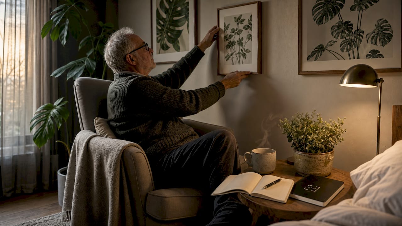
- Use the eye-level standard. Center artwork 57–60 inches from the floor. This is the standard used in most professional galleries and keeps art at a natural viewing height.
- Leave 6–8 inches between furniture and art. This gap keeps the piece visually connected to what’s below it without feeling cramped.
- Treat gallery walls as one unit. Good Housekeeping, quoting designer Bilal Rehman, recommends varying frame sizes and treating the entire gallery wall as a single composition centered at eye level, not centering each frame individually.
| Furniture Width | Recommended Art Width | Placement Height |
|---|---|---|
| 48 inches (loveseat) | 32–36 inches | Center at 57–60 inches |
| 72 inches (sofa) | 48–54 inches | Center at 57–60 inches |
| 84 inches (king bed) | 56–63 inches | 6–8 inches above headboard |
For more detail on portrait vs. landscape formats and how each affects visual balance, Artify’s guide breaks down the decision clearly.
Pro Tip: When building a gallery wall, lay all your frames on the floor first and arrange them as a group. Photograph the arrangement from above before committing to nails.
How do you match art style and color to your interior?
Art style selection is where personal taste and design principles meet. The goal is not to match everything perfectly. Ivy Grey Interiors recommends avoiding overly matched interiors, which can feel flat and overdone. Connection through tone and texture creates more timeless results than exact color matching.
Two reliable approaches work for most rooms:
- The harmonious method: Choose art that shares at least two dominant colors with your existing furniture or textiles. A room with navy cushions and warm wood tones pairs naturally with art that carries both.
- The contrast method: In neutral rooms with white or gray walls, bold art creates the focal point the space needs. A single large abstract in deep ochre or forest green can define an entire living room.
The 60-30-10 color rule applies here too. If your room is 60% neutral, 30% a secondary tone, and 10% accent color, your art can carry that accent color and tie the whole scheme together. Martha Stewart and Kit Kemp both emphasize that art should engage in a dialogue with its architectural surroundings, balancing contrast with cohesion.
Art style by interior theme:
- Modern or minimalist rooms: Abstract prints, black-and-white photography, or geometric compositions. Browse Artify’s modern wall art guide for current options.
- Traditional or classic interiors: Landscapes, portraiture, or botanical illustrations in ornate frames.
- Mid-century modern spaces: Graphic prints, warm earth tones, and organic shapes.
- Eclectic rooms: Mixed media and layered styles. Eclectic living room decor works best when pieces share a tonal family even if their styles differ.
Botanical prints bring calm to bedrooms and reading nooks. Dramatic, dark-toned pieces add formality to dining rooms. The mood your art creates is as deliberate a choice as the color of your walls.
How does lighting affect art preservation?
Light is the single biggest threat to art longevity in a home setting. Art on paper and photographs are especially vulnerable to UV damage, even indoors. Cumulative light exposure causes fading, yellowing, and brittleness over time. This damage is chemical and irreversible.
“Light damage to paper-based art is cumulative and molecular. Framing and placement strategies can slow degradation significantly, but no amount of restoration fully reverses it.” — Fine Art Restoration
Practical steps to protect your art:
- Avoid direct sunlight. Never hang works on paper, photography, or watercolors on walls that receive direct sun for more than an hour daily.
- Use UV-protective glazing. Museum-quality glass or acrylic blocks the wavelengths most responsible for fading. Artify offers framing options that include protective finishes suited to different art types.
- Choose canvas or textured prints for bright rooms. These materials handle light exposure better than paper-based works and reduce glare.
- Position artificial lighting carefully. Picture lights and track lighting should illuminate art at a 30-degree angle to enhance texture without creating hot spots or accelerating heat damage.
For wellness-focused spaces like yoga rooms, where calm and longevity of décor both matter, calming art placement and light-safe materials are especially worth prioritizing.
What are the best renter-friendly hanging options?
Renters can display art confidently without putting their security deposit at risk. The key is using the right products and the right technique.
- Use Command Strips for lightweight pieces. House of Eme’s renter-friendly guide outlines a clear installation checklist: clean the wall with isopropyl alcohol, wait an hour before hanging, and press firmly for 30 seconds.
- Pull the tab straight down, parallel to the wall. This is the removal step most people get wrong. Pulling at an angle tears paint. Pulling straight down releases the adhesive cleanly.
- Check weight limits before hanging. Command Strips are rated by weight. Exceeding the limit is the most common cause of art falling and wall damage.
- Choose lightweight frames. Aluminum frames and acrylic-faced prints weigh significantly less than traditional wood and glass combinations, making them ideal for adhesive hanging.
- Avoid textured walls. Adhesive strips do not bond reliably to brick, rough plaster, or heavily textured paint. Use a picture rail hook or a tension rod system instead.
Pro Tip: Before applying any adhesive product, test a small strip in an inconspicuous spot and remove it after 24 hours. This tells you how your specific wall paint will respond before you commit to a full display.
For a full walkthrough of mounting options and tools, Artify’s framed art selection guide covers both renter and homeowner scenarios in detail.
Key takeaways
The most effective approach to choosing art for home combines room assessment, correct sizing, style matching, light protection, and damage-free hanging into one deliberate process.
| Point | Details |
|---|---|
| Assess your room first | Measure walls, observe natural light, and consider room function before selecting any piece. |
| Follow the two-thirds rule | Art above furniture should span roughly two-thirds of that furniture’s width for visual balance. |
| Match tone, not just color | Connect art to your interior through shared tones and textures rather than exact color matching. |
| Protect paper-based art from light | Avoid direct sunlight and use UV-protective glazing to prevent irreversible fading and degradation. |
| Use correct removal technique | Pull adhesive strip tabs straight down, parallel to the wall, to preserve paint when renting. |
What choosing art has taught me about living with it
The advice I find most honest comes from Kit Kemp: the best art is the piece you cannot stop looking at, regardless of price or origin. That standard cuts through every design rule in this article. Rules about scale and placement are real and useful. But they serve one purpose: to make the art you love look its best in the space you have.
What I have noticed, working with people selecting art for their homes, is that the biggest regrets come from playing it safe. Neutral prints that “go with everything” tend to disappear into the room. The pieces that make a home feel genuinely personal are the ones that took a little courage. A large abstract in a color you were not sure about. A photograph from a trip that meant something. A print by an independent artist whose work stopped you mid-scroll.
The other thing worth saying: your art does not have to be permanent. Rearranging pieces between rooms, swapping frames, or adding a new piece to an existing gallery wall keeps a home feeling alive. Treat your collection as something that grows with you, not a decision you make once and live with forever. Mix price points freely. A $30 print in a beautiful frame can hold its own next to something you saved up for. What matters is that the combination feels like you.
— Artify
Find art that fits your space at Artify
Knowing the rules is one thing. Finding the right piece is another.
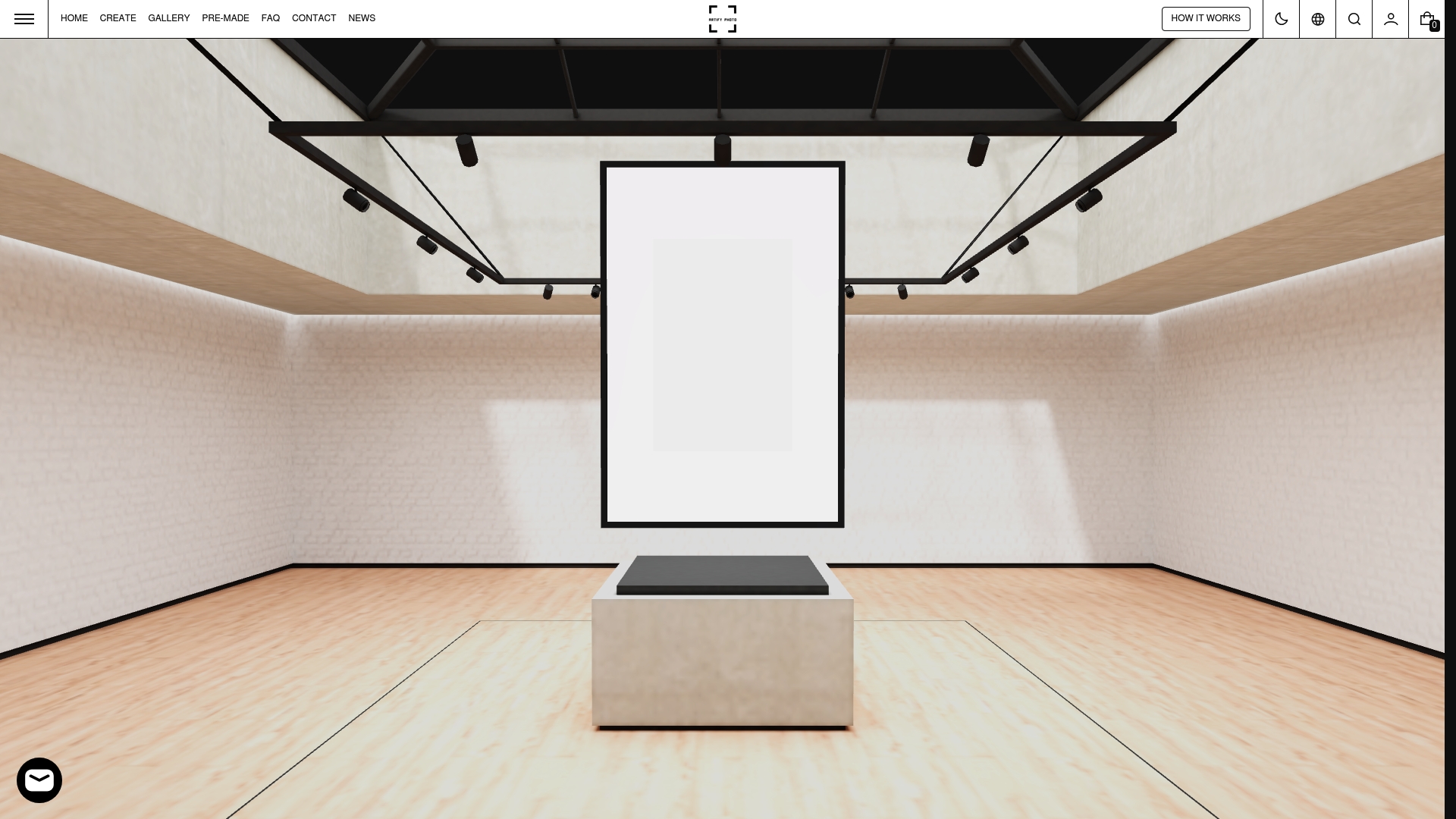
Artify’s pre-made collections are organized by style and mood, making it straightforward to find art that fits a modern living room, a calm bedroom, or an eclectic hallway without hours of browsing. Every piece is printed on demand by independent artists and available with expert framing options, including protective finishes suited to bright rooms. If you want something more personal, Artify’s custom art tools let you turn your own photographs into gallery-quality prints, complete with a 3D room preview so you can see exactly how a piece will look before it ships. Fast delivery and lightweight framing options make the whole process renter-friendly from start to finish.
FAQ
What is the two-thirds rule for hanging art?
The two-thirds rule states that art hung above furniture should span roughly two-thirds of that furniture’s width. This keeps the piece visually anchored to what is below it rather than floating on the wall.
How high should art be hung on a wall?
Center artwork 57–60 inches from the floor. This is the standard gallery height and places the visual center of the piece at average eye level for most adults.
What art styles work best for a living room?
Abstract prints, large-format photography, and bold graphic compositions work well as art pieces for living rooms because they create focal points and hold attention across a larger space. Style should align with your existing furniture and color palette.
How do i hang art without damaging walls as a renter?
Use Command Strips rated for your frame’s weight, clean the wall with isopropyl alcohol before applying, and remove by pulling the tab straight down parallel to the wall. House of Eme’s checklist covers each step in detail.
Can i mix different art styles in the same room?
Yes. Ivy Grey Interiors recommends connecting mixed styles through shared tone and texture rather than matching subjects or periods exactly. A consistent tonal family ties diverse pieces together without making the room feel overdone.