


TL;DR:
- Choosing matte reduces glare and keeps viewer focus on the art, making it ideal for unpredictable lighting. Finishes like lustre or gloss enhance color vibrancy and contrast but require controlled lighting to prevent reflections. The environment and artwork type primarily determine the best finish choice for displaying high-quality prints.
Choose matte for glare-free display, textured papers for painterly work, and baryta or lustre when you need deep blacks and punchy color without a mirror-like surface. Finish isn’t decoration — it’s the single biggest variable in how your print reads under real-world light. A gloss print in a sun-drenched living room turns into a rectangle of reflected ceiling. The same image on matte baryta holds its shadow detail and stays readable from every angle.
Here’s the short version: matte absorbs light and keeps viewer focus on the art; satin/lustre splits the difference with subtle sheen and strong color; gloss maximizes saturation and contrast but demands controlled lighting; textured papers (cotton rag, watercolor) recreate the feel of traditional media; metallic/pearl adds iridescent depth for bold, graphic work; canvas scatters light completely for a warm, painterly result.
Pro Tip: Before committing to a full print run, request a small proof on matte baryta and on lustre. The difference in black depth and color warmth between those two alone will tell you more than any description.
Table of Contents
- What do the common art print finishes actually mean?
- Which papers and substrates change how a finish looks?
- How does changing the finish actually change what you see?
- Which finish suits your type of artwork?
- Do coatings and archival specs actually matter?
- How do framing and lighting interact with your finish choice?
- What is a giclée print, and does it affect finish choice?
- How do you actually choose a finish? A step-by-step checklist
- What does Artify recommend for common buyer profiles?
- Are some finishes more sustainable than others?
- What do different finishes cost, and how should you budget?
- Key Takeaways
- The finish decision most people get backwards
- Artify makes finish decisions easier
- Useful sources
- FAQ
What do the common art print finishes actually mean?
Understanding art print finishes starts with knowing what each one physically is, not just how it looks in a thumbnail.
Matte
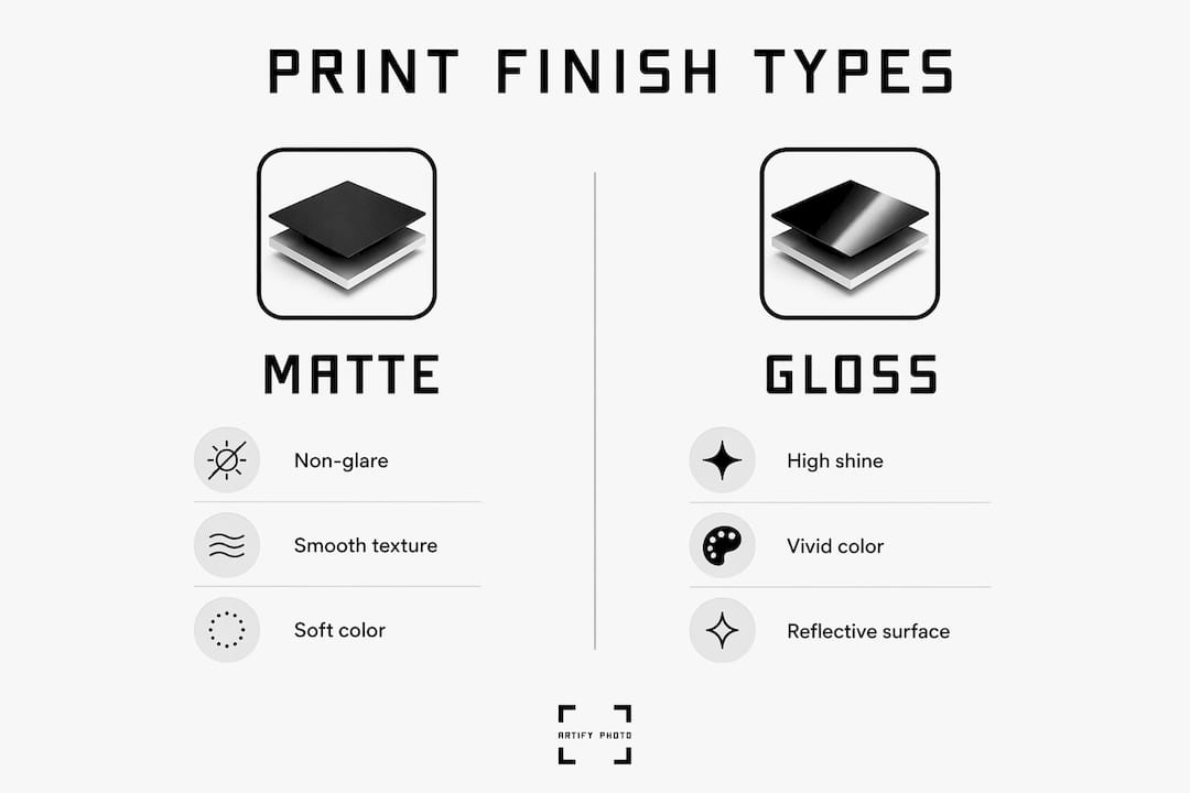
Matte paper has a non-coated or lightly coated surface that absorbs and scatters light rather than reflecting it. Colors appear slightly softer and less saturated than on gloss, but the image stays readable from any angle. Many artist-focused guides call matte the default choice for gallery and fair display because it eliminates glare and lets you sign or edition the print without smearing. The surface has a slight tooth, which gives it a tactile quality that feels closer to traditional art paper.
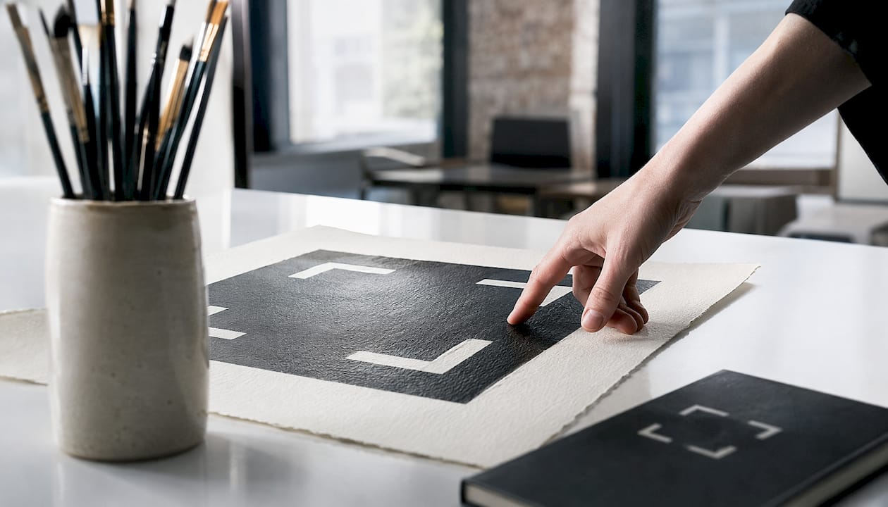
Pros: No glare, easy to sign, works under unpredictable lighting, pairs well with glazed frames. Cons: Lower color saturation than gloss; blacks can look slightly flat on standard cotton-rag matte.
Satin / Lustre
Lustre sits between matte and gloss visually — a slight sheen with subtle texture that increases perceived contrast and color without the mirror-like reflectivity of high gloss. Labs often describe it as professional-grade: you get most of gloss’s color punch with far less glare. The surface has a fine, almost pearlescent grain that adds warmth and depth.
Pros: Strong color, limited glare, versatile for photography and mixed-media work. Cons: Can show fingerprints; not as easy to sign cleanly as matte.
Gloss
Gloss coatings reflect light directly back toward the viewer, producing vivid, punchy color and high apparent contrast. It’s the finish that makes colors look most like they do on a calibrated screen. The trade-off is significant: gloss creates glare in rooms with windows, overhead lighting, or multiple light sources.
Pros: Maximum color saturation, highest contrast, dramatic shadow detail. Cons: Heavy glare in bright rooms, shows fingerprints immediately, not suitable for signing.
Soft-Touch / Velvet Lamination
Soft-touch is a laminate applied over a print that gives the surface a velvety, almost suede-like feel. It’s matte in appearance but distinctly tactile. Popular for limited-edition art prints and packaging, it adds scuff resistance and a premium physical presence.
Pros: Luxurious feel, scuff-resistant, matte appearance. Cons: Adds cost; lamination is not reversible; not standard for fine art archival use.
Metallic / Pearl
Lustre/pearl finishes provide a near-photographic look with high color intensity and a subtle pearlescent texture. Metallic papers go further, using a base that creates an iridescent shimmer. Both work well for bold, graphic imagery or photographs with strong color contrast. They’re not the right call for subtle tonal work — the shimmer competes with fine gradients.
Pros: High color intensity, eye-catching depth, works beautifully for bold subjects. Cons: Shimmer can distract from subtle tonal gradients; not ideal for traditional media reproductions.
Spot Gloss / UV Varnish
Spot UV and special coatings are stylistic choices rather than archival necessities. Spot gloss applies a high-shine coating to selected areas of a print, leaving the rest matte. UV varnish covers the full surface with a clear protective layer cured under ultraviolet light. Both add cost and are more common in commercial or limited-edition contexts than in standard fine art printing.
Pros: Dramatic visual contrast (spot gloss); strong surface protection (UV varnish). Cons: Increases cost; can look gimmicky if overused; not standard for gallery fine art.
Which papers and substrates change how a finish looks?
Finish and substrate are inseparable. The same “matte” designation on a cotton-rag paper versus a standard inkjet-coated sheet produces a noticeably different result.
| Substrate | Surface Character | Weight Range | Best Finish Pairings |
|---|---|---|---|
| Cotton rag (smooth) | Smooth, slightly toothy, 100% cotton | 308–340 gsm | Matte, matte baryta, lustre |
| Matte baryta | Barium sulfate coating on cotton; flat yet rich | 300–340 gsm | Matte (non-reflective baryta) |
| Baryta (gloss/satin) | High-gloss or satin baryta coating; warm whites | 300–340 gsm | Gloss, satin |
| Watercolor / Aquarelle rag | Visible grain/tooth, cotton, mould-made texture | 300–340 gsm | Matte, uncoated |
| Inkjet-coated paper | Smooth, bright white, resin or clay coating | — | Gloss, satin, lustre |
| Canvas | Woven fabric, stretched or rolled | Varies | Matte giclée, metallic canvas |
Textured fine art papers have visible tooth that breaks up light, making them ideal for watercolors, pastels, and reproductions of traditional media, and pair beautifully with soft textiles like cotton rugs to enhance a warm, inviting living space. That tooth diffuses light across the surface, softening micro-detail in a way that actually helps painterly work look more authentic — the texture mimics the original support.
Baryta papers occupy a special category. The barium sulfate coating sits between traditional darkroom fiber-base paper and modern inkjet coatings. Matte baryta achieves a higher Dmax (maximum black density) and richer color saturation than standard cotton-rag matte, without any reflective gloss. That’s the reason gallery photographers reach for it first.
Premium paper brands commonly available from U.S. fine art labs include Hahnemühle, Moab, and Epson lines, covering smooth matte, baryta, metallic, and textured cotton rags at weights typically between 300–340 gsm. Hahnemühle Photo Rag 308 and Moab Entrada Bright Rag are two of the most widely stocked options for fine art giclée work.
Example pairings:
- Landscape photography → baryta matte or lustre (preserves shadow detail, controls glare)
- Watercolor reproduction → textured cotton rag with matte finish (recreates tooth and softness)
- Bold graphic poster → metallic or gloss inkjet-coated paper (maximizes color impact)
- Portrait photography → smooth matte cotton rag or satin (flatters skin tones, no glare)
How does changing the finish actually change what you see?
Swap the finish on the same image and you’re not making a minor tweak — you’re changing the viewing experience in ways that are immediately obvious to anyone standing in front of the print.
-
Color saturation and vibrancy. Gloss and metallic surfaces reflect light back toward the viewer, which makes colors appear more saturated and punchy. Matte surfaces absorb light, so colors read slightly softer. The difference is most visible in saturated reds, blues, and greens.
-
Shadow detail and Dmax. Gloss and baryta papers achieve the deepest blacks (highest Dmax). Standard cotton-rag matte produces slightly lighter blacks, which can make shadow areas look flatter. Matte baryta is recommended for gallery photography precisely because it eliminates glare while preserving deep blacks and rich color.
-
Perceived sharpness. Smooth, coated surfaces (gloss, lustre, baryta) preserve micro-detail better than textured papers. A textured watercolor paper softens fine edges slightly — a feature, not a flaw, when the original artwork had that quality.
-
Reflectivity and glare. A gloss print in a room with a window behind the viewer becomes a mirror. Lustre reduces that effect substantially. Matte eliminates it. Canvas scatters light in all directions, producing zero reflectivity.
-
Tactile impression. Touch matters more than people expect. A soft-touch laminate feels completely different from a cotton-rag matte, even though both look non-reflective. Buyers at art fairs consistently pick up prints — the surface feel influences perceived value.
A useful mental comparison: the same landscape photograph on high-gloss paper looks like a backlit screen — vivid, almost electric. On matte baryta, the same image reads like a darkroom print: rich, dimensional, and completely free of distraction. Neither is wrong. They’re different objects.
Which finish suits your type of artwork?
Fine art photography
Baryta matte or lustre. Both preserve shadow detail and color depth. For gallery exhibition, matte baryta is the standard recommendation because it handles unpredictable gallery lighting without glare. For home display in a controlled room, lustre gives slightly more color pop.
Watercolor and pastel reproductions
Textured cotton rag with a matte finish. The paper’s tooth recreates the visual texture of the original support, and the matte surface keeps the softness of the medium intact. Gloss on a watercolor reproduction looks wrong immediately — too hard, too reflective.
Ink drawings and line art
Smooth matte cotton rag. Clean lines read crisply on a smooth surface, and matte keeps the graphic quality without adding unwanted shimmer. Gloss works here too if the display environment is controlled.
Oil and acrylic reproductions
Textured canvas or textured cotton rag. Canvas is the obvious choice for oil reproductions because the woven surface mimics the original ground. For acrylic work with flat color fields, smooth matte or lustre can work well.
Posters and graphic prints
Gloss or metallic. These formats are designed for visual impact, and gloss maximizes that. Metallic adds an extra dimension for bold, graphic imagery. Neither is appropriate for fine art archival contexts.
Canvas art (ready-to-hang)
Standard giclée canvas with a matte or satin varnish coating. Canvas texture diffuses light completely, eliminating glare. A protective varnish coat (gloss or satin) is typically applied after printing to unify the surface and add UV protection.
Exception worth noting: portrait photography on gloss can work beautifully in a dim interior with directional lighting. The rule “matte for portraits” holds in most rooms, but a controlled environment changes the calculus entirely.
Do coatings and archival specs actually matter?
They do, and the difference between a print that lasts decades and one that fades in a few years comes down to three things: ink type, substrate, and protective coating.
Protective coating options:
- Varnish (gloss or satin): Applied over canvas giclée prints to unify the surface and add UV protection. Reversible in some formulations, which matters for conservation.
- Lamination (soft-touch or gloss): A plastic film bonded to the print surface. Adds scuff resistance and moisture protection. Not reversible; not standard for fine art archival use.
- UV coating: A clear liquid applied and cured under UV light. Protects against fading from light exposure. Common on commercial prints; available as an add-on from some fine art labs.
- Anti-scuff coatings: Applied over matte surfaces to reduce surface marking during handling. Useful for prints that will be shipped or handled frequently.
Archival considerations:
Pigment-based archival inks and high-end inkjet printing yield prints with richer depth, clarity, and longevity. Dye-based inks, used in mass-market and consumer inkjet printers, fade significantly faster under light exposure. For any print intended to last, ask your lab specifically whether they use pigment or dye inks.
Substrate matters equally. Acid-free, pH-neutral, cotton or alpha-cellulose bases resist yellowing and degradation over time. Fine art paper prints using archival pigment inks on heavyweight cotton rag or baryta paper carry archival certifications that typically run 100+ years under museum-display conditions.
Care and handling checklist:
- Store unframed prints flat or rolled in acid-free tissue, away from humidity and direct light.
- Frame with acid-free matting and backing board — never let the print touch the glass directly.
- Use UV-protective glazing (glass or acrylic) for any print displayed near a window.
- Clean glazing with a soft, dry cloth; never spray cleaner directly onto a framed print.
- Avoid hanging prints in direct sunlight or above heat sources.
- Handle prints by the edges; skin oils accelerate surface degradation on uncoated papers.
How do framing and lighting interact with your finish choice?
The finish you choose and the frame you put it in are not independent decisions. Glazing changes everything.
| Display scenario | Recommended finish | Glazing guidance |
|---|---|---|
| Bright room, large windows | Matte or satin | Anti-reflective acrylic or museum glass |
| Gallery wall, controlled lighting | Matte baryta or lustre | Museum glass or unglazed (matte only) |
| Dim interior, directional spot light | Gloss or metallic | Standard clear glass or unglazed |
| Home office, mixed lighting | Satin / lustre | Anti-reflective acrylic |
| Canvas (ready-to-hang) | Matte giclée varnish | No glazing needed |
Standard clear glass amplifies glare on gloss prints — it adds its own reflective layer on top of an already-reflective surface. Anti-reflective acrylic (brands like Tru Vue Optium) reduces surface reflection to near zero, which means you can use a matte or satin print without any glazing-induced glare. Museum glass achieves similar results with higher optical clarity.
Unglazed display is an option for matte prints only. A matte surface has enough diffusion to handle ambient light without glazing, and skipping the glass keeps the tactile quality of the paper visible. Gloss prints should always be glazed — an unglazed gloss print in a lit room is nearly unviewable.
Pro Tip: For directional spot lighting (a common gallery setup), angle the light at roughly 30 degrees from the wall surface. At that angle, gloss and lustre prints produce their most dramatic shadow depth without the viewer catching direct reflection. Matte prints are more forgiving of angle, but warm-toned light (2700–3000K) flatters both baryta and cotton-rag surfaces better than cool white.
What is a giclée print, and does it affect finish choice?
Giclée is a printing process, not a finish. The word describes high-resolution, museum-grade printing using archival pigment inks and professional inkjet printers. A giclée print’s distinguishing features are archival longevity and color fidelity — the finish you choose is a separate decision layered on top of that process.
Because giclée uses pigment inks and archival substrates, it’s compatible with virtually every fine art finish: matte, baryta, textured cotton rag, lustre, metallic, and canvas. That flexibility is one of its practical advantages. You’re not locked into a single surface.
The contrast with mass-market printing is significant. A standard poster print typically uses dye-based inks on a lightweight coated paper. Dye inks fade faster, the substrate is not acid-free, and finish options are usually limited to gloss or matte on a single paper stock. The archival performance of a giclée print stems from pigment-based inks and archival substrates — finish choice mainly affects optics and handling, not the intrinsic pigment permanence when both inputs are archival.
For collectors and gallery buyers, giclée on cotton rag or baryta is the baseline expectation. For casual home decor, a well-executed dye print on quality paper may be entirely adequate. The decision depends on how long you want the print to last and whether it will be displayed in direct or indirect light.
How do you actually choose a finish? A step-by-step checklist
-
Identify the artwork’s intent. Is this a gallery piece, a gift, home decor, or a limited-edition collector print? Gallery and collector work demands archival specs. Home decor has more flexibility.
-
Evaluate detail vs. texture needs. High-detail photography benefits from smooth, coated substrates (baryta, lustre). Traditional media reproductions benefit from textured surfaces that recreate the original tactile cues.
-
Assess the display environment. Bright room with windows? Matte or satin with anti-reflective glazing. Dim room with directional lighting? Gloss or metallic can shine. Unknown or variable lighting? Matte baryta is the safest call.
-
Request a proof. Ask printers for a proof with the exact paper and finish combination you plan to use. Visual differences between finishes can be large enough that a full proof prevents costly mismatches in bulk orders.
-
Choose glazing and framing to match. Matte prints can go unglazed or with museum glass. Gloss prints need anti-reflective glazing. Canvas needs no glazing.
-
Order the final run only after approving the proof.
Questions to ask your printer:
- What paper brand and weight do you use for this finish?
- Are your inks pigment-based or dye-based?
- Do you offer proofing, and what’s the turnaround?
- What are the archival specs (longevity rating, acid-free certification)?
- Is a protective coating included, and what type?
- Can I request a sample of the paper stock before ordering?
Sample proof request template: “I’d like a proof of [file name] on [paper name, e.g., Hahnemühle Photo Rag Baryta] at [size]. Please confirm the ink type and whether a protective coating is applied. I’ll approve the proof before the full order.”
Budget note: Spot UV and metallic finishes are genuine value-adds for bold graphic work or limited editions. For standard fine art photography, they’re usually upsells that don’t improve perceived quality. Spend the budget on a better paper stock instead.
What does Artify recommend for common buyer profiles?
Artify’s approach to finish selection is grounded in the same principles that guide fine art labs: match the substrate and finish to the image content, the display environment, and the intended longevity. Here’s how that plays out for the most common buyer types:
- Gallery exhibitor or fine art photographer: Baryta matte on 100% cotton paper. Deep blacks, no glare, archival pigment inks. Pairs with museum glass and acid-free matting.
- Watercolor or traditional media artist: Textured cotton rag with a matte finish. The paper’s tooth recreates the visual texture of the original, and the matte surface keeps the softness of the medium intact.
- Gift buyer or first-time decorator: Lustre or satin on a smooth cotton-rag paper. Strong color, limited glare, and a finish that looks professional in any room without requiring controlled lighting.
- Collector seeking a limited edition: Museum-grade giclée on baryta or metallic cotton rag, with a certificate of authenticity and archival specs. Artify’s fine art print workflow supports pigment inks and archival substrates as standard.
Artify’s platform also offers 3D room previews, so you can see how a finish reads in a specific room environment before ordering. That single feature addresses the most common source of finish regret: choosing a gloss print for a bright room without accounting for glare.
For readers who want to see finished examples across different substrates, the Artify gallery shows real-world outcomes across multiple finish and framing combinations.
Are some finishes more sustainable than others?
The environmental footprint of a print comes from three sources: the substrate, the ink, and any coatings or laminates applied after printing.
Cotton-rag papers are generally considered more sustainable than synthetic or resin-coated papers. Cotton is a natural fiber, and many fine art cotton-rag papers are produced without optical brightening agents or harmful coatings. Acid-free, pH-neutral papers also have a longer useful life, which means fewer reprints over time.
Pigment inks, standard in giclée printing, typically have a lower environmental impact than solvent-based inks used in some large-format commercial printing. Water-based pigment inks are the norm at fine art labs and produce fewer volatile organic compounds during printing.
Laminates and UV coatings add a plastic or chemical layer that complicates recycling. Soft-touch lamination, in particular, bonds a plastic film permanently to the paper, making the finished product non-recyclable in standard paper streams. For buyers who prioritize sustainability, uncoated or varnish-finished prints on cotton-rag paper are the cleaner choice.
Canvas prints on synthetic polyester canvas have a higher synthetic content than cotton-rag paper prints, though many labs now offer natural cotton canvas as an alternative. If sustainability is a priority, ask your lab specifically about the canvas fiber content and whether the stretcher bars are FSC-certified wood.
What do different finishes cost, and how should you budget?
Finish choice has a real effect on price, and the differences compound quickly at larger sizes.
Standard matte on an inkjet-coated paper is typically the entry point for fine art printing. Moving to cotton-rag matte adds cost because the substrate itself is more expensive. Baryta papers sit above cotton-rag matte in most lab pricing. Metallic and specialty papers (Hahnemühle Photo Rag Metallic, for example) are usually the most expensive paper options.
As a reference point, WHCC’s fine art print pricing shows smooth matte starting lower than premium papers like Photo Rag Baryta, Torchon, and metallic variants at equivalent sizes. The premium for specialty papers is consistent across labs.
Coatings add cost on top of paper selection. Soft-touch lamination, spot UV, and UV varnish are typically priced as add-ons. For a standard fine art print, a protective varnish on canvas is usually included in the base price; lamination on paper prints is an explicit upgrade.
Proofing adds a small upfront cost but almost always saves money on bulk orders by catching finish mismatches before they become expensive. A single proof at a small size costs a fraction of reprinting a full edition.
The practical budget hierarchy: start with the paper stock, then the ink type, then protective coatings. Don’t spend money on spot UV or metallic finishes for work that doesn’t benefit from them. For a types of art prints overview that covers format and size decisions alongside finish, that resource is worth reading before you finalize your order.
Key Takeaways
The single most important rule in selecting an art print finish: match the surface to the light in the room where the print will hang, then match it to the content of the image.
| Point | Details |
|---|---|
| Matte for unpredictable lighting | Matte and matte baryta eliminate glare and work under any lighting condition without glazing issues. |
| Baryta for deep blacks | Matte baryta achieves higher Dmax and richer color than standard cotton-rag matte, making it the gallery photography standard. |
| Texture fits traditional media | Textured cotton rag recreates the tooth of watercolor and pastel originals; smooth surfaces suit photography. |
| Always proof before bulk orders | A single proof on your chosen paper and finish prevents costly reprints from finish mismatches. |
| Artify for museum-grade results | Artify produces giclée prints on archival substrates with 3D room previews to match finish to display environment before ordering. |
The finish decision most people get backwards
The conventional advice is to pick a finish based on how the image looks. That’s not wrong, but it’s incomplete in a way that causes real problems. The more important question is where the print will live.
Artify’s perspective: the display environment should be the first filter, not the last. A stunning baryta matte print in a dim hallway with a single warm spotlight will outperform a gloss print in a bright living room every time, even if the gloss print looks more impressive in a lab proof. Finish selection is an environmental decision as much as an aesthetic one.
The other misconception worth addressing: giclée is not a finish, and “archival” is not a marketing word. Both terms describe real, verifiable properties. When a lab can’t tell you the ink type, the paper’s pH rating, or the archival certification, that’s the answer you need. Proofs exist precisely because the gap between a screen preview and a physical print is wider than most buyers expect. Request one. The cost is minimal; the information is not.
Artify makes finish decisions easier
Choosing the right finish is simpler when you can see the result before committing. Artify produces museum-grade giclée prints on archival substrates, with finish options that cover the full range: matte, baryta, lustre, textured cotton rag, and canvas. Every order includes a 3D room preview so you can see how your chosen finish reads in your actual space before the print ships.
For buyers who want to start with a finished piece rather than a custom proof, Artify’s pre-made collections offer gallery-quality prints across multiple formats and finishes, ready to order. For custom work, the how it works page walks through the full process from upload to delivery, including proofing options and framing. Quality checks are built into every order, and Artify’s returns policy covers any print that doesn’t meet the standard you approved.
Useful sources
- Fine Art Paper Explained: Matte vs Baryta vs Textured — Giclée UK — The clearest breakdown of baryta, cotton rag, and textured paper differences for fine art photography.
- How to Choose the Right Print Medium for Your Photography — Photography Talk — Practical guidance on how light, room conditions, and image content drive medium selection.
- Fine Art Prints — WHCC — U.S. lab reference for paper options, weights, and pricing across fine art giclée surfaces.
- Giclée Printing for Artists — Printful — Overview of archival pigment ink printing and why proofing matters before bulk orders.
- Art Prints Explained — Town Quay Studios — Beginner-friendly primer on giclée as a process versus a finish, with notes on archival standards.
- Papers Used by the Labs for Print — SmugMug Support — Lab-sourced descriptions of lustre, pearl, and satin paper characteristics.
- Fine Art Prints — Bay Photo Lab — U.S. lab listing of premium paper brands (Hahnemühle, Moab, Epson) and their finish categories.
- Matte vs Glossy Art Prints — Printkeg — Artist-focused comparison of matte and gloss for gallery, fair, and home display contexts.
- Print Finishing Techniques — Gelato — Broad overview of finishing options including UV coating, lamination, varnish, and spot gloss.
FAQ
What finish is best for art prints?
Matte baryta is the most versatile choice for fine art photography because it combines deep blacks and rich color with zero glare. For painterly reproductions, textured cotton rag with a matte finish is the standard recommendation.
What is the difference between a giclée and a regular print?
Giclée refers to a high-resolution printing process using archival pigment inks and professional inkjet printers — it describes the process and quality standard, not the finish. A regular or mass-market print typically uses dye-based inks on lighter, non-archival paper, with a shorter lifespan and fewer finish options.
What are the main types of printing finishes?
The primary finish categories for art prints are matte, satin/lustre, gloss, textured (cotton rag, watercolor paper), metallic/pearl, and canvas. Each differs in reflectivity, color saturation, tactile feel, and suitability for different artwork types and display environments.
How do you avoid glare on a framed art print?
Choose a matte or satin finish and pair it with anti-reflective acrylic or museum glass. For canvas prints, no glazing is needed since the woven texture scatters light completely. Gloss prints in bright rooms require anti-reflective glazing to remain viewable from multiple angles.
Can you sign a print on a textured or matte surface?
Yes. Matte and textured papers are the easiest surfaces to sign because the tooth grips ink from a pen or marker. Gloss and metallic surfaces resist most inks and are not suitable for hand-signing without a specialist pen.